Guardian Bikes
At Guardian Bikes, I led UX-forward visual design across emails, web content, and landing pages. I optimized content for brand consistency and high-impact engagement at the top of the funnel. My work elevated aesthetics and drove measurable results, boosting overall engagement by 30% (see metrics below).
Skills
Adobe Creative Suite, Figma, Sketch, Asana
Role
Senior Visual & UX Designer
-
![]()
Email Campaigns
Designed welcome and post purchase
email journeys -
![]()
User Experience Design
Preformed regular case studies on
underperforming content -
![]()
Product Design
Created custom illustrations for new products
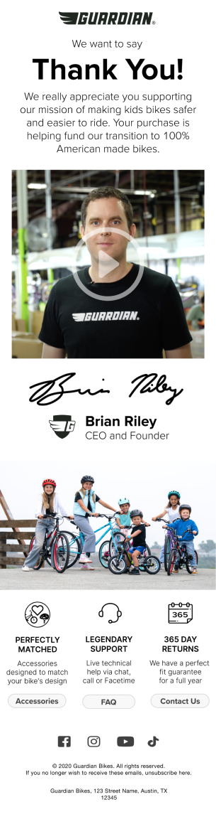
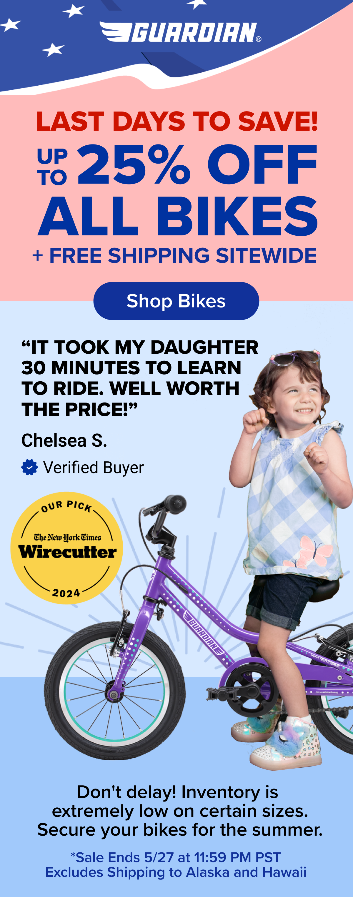
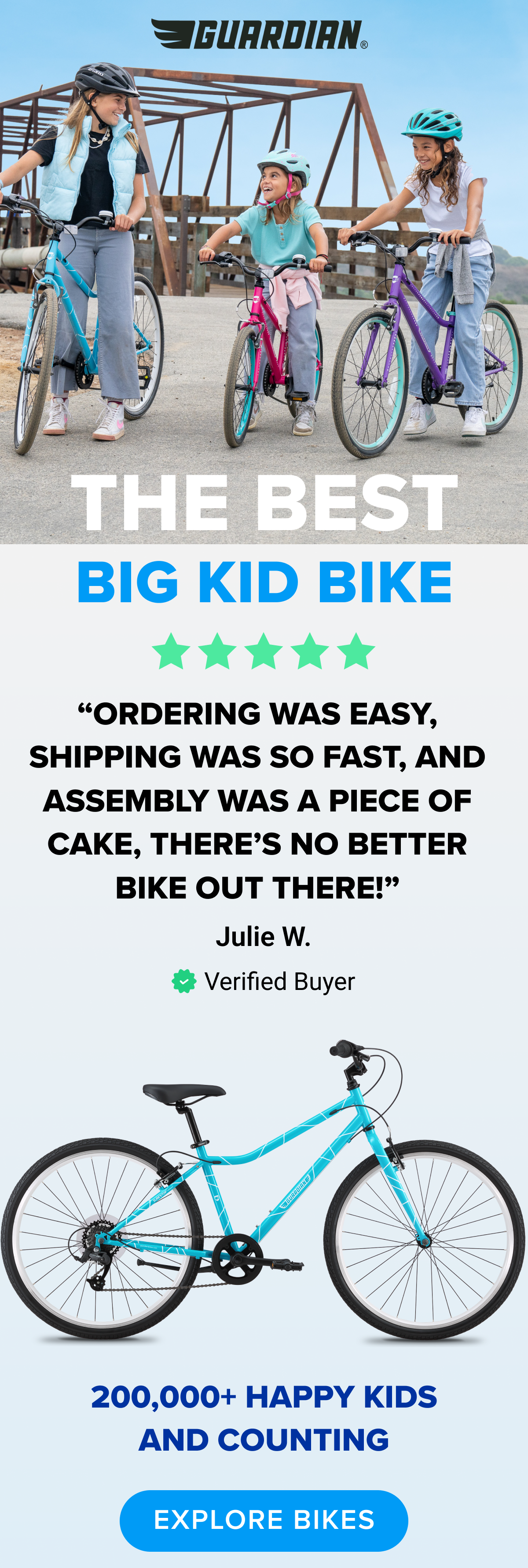
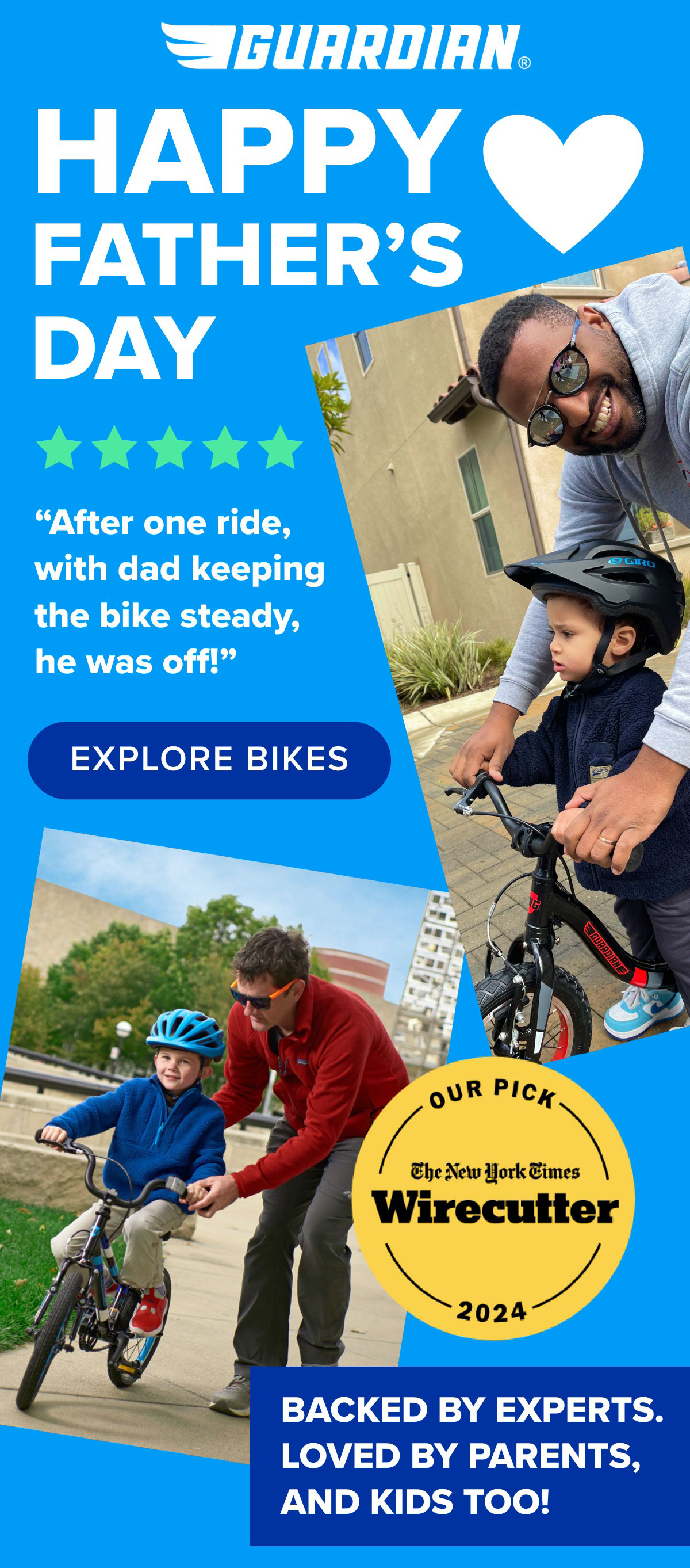
Email Journeys: Welcome &
Post-Purchase Series
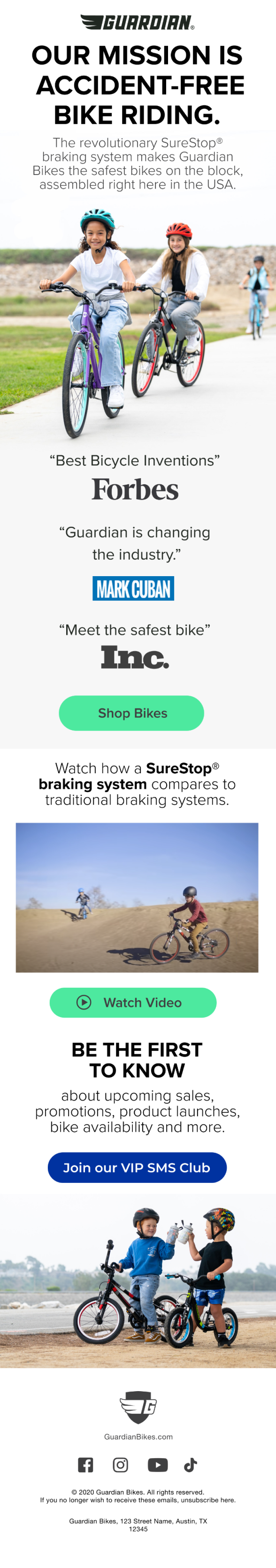
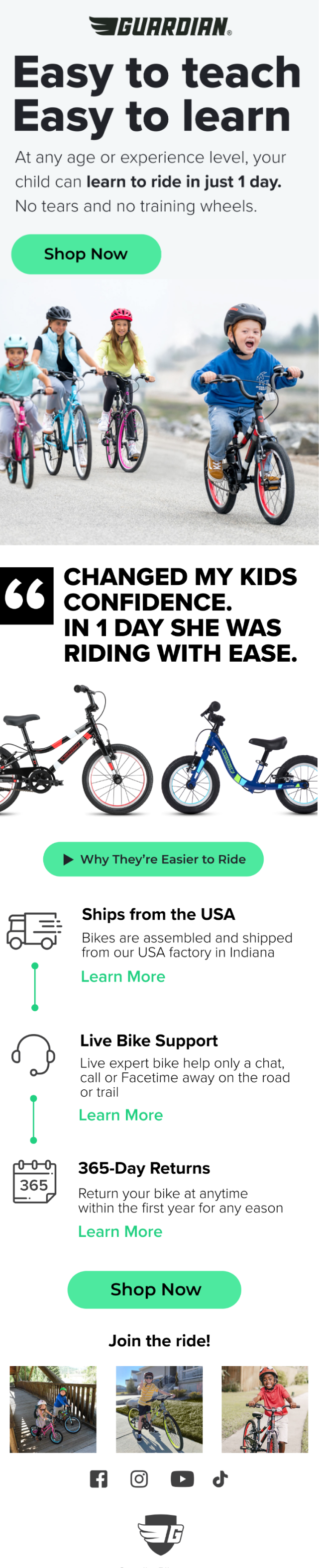
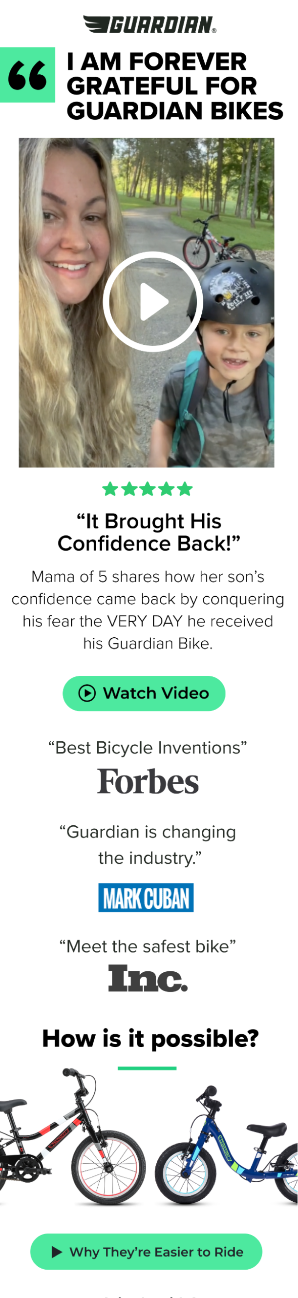
I redesigned the brand’s email welcome series from the ground up, using clean Figma layouts and intuitive visual signposts to guide new users through their first interactions with the brand. By focusing on clarity and onboarding momentum, I helped increase prospect-to-customer conversion by 50%.
After purchase, I extended the journey with a thoughtful cross-sell flow—pairing original illustrations with dynamic product modules to personalize recommendations. This post-purchase experience drove a 33% lift in accessory kit revenue and deepened customer engagement.
User Experience Design
I completed several user experience audits on the company’s website. After reviewing user data, I was able to find valuable insights that guided a redesign of the homepage and product display pages. The updated designs had an average 30% higher conversion rate than previous iterations.
UX Audit → Homepage Revamp

Understanding the Roadblocks
Guardian Bikes’ website was falling short in crucial conversion funnels, and I set out to uncover why. I led a UX audit that combined heatmap analysis, scroll-depth metrics, and real user feedback to identify key friction points in the shopping journey.Digging Deeper with Research
To supplement the quantitative data, I designed and distributed an email survey to 50 recent customers and conducted on-site interviews. I also facilitated one-on-one usability testing sessions and used affinity mapping to synthesize recurring themes.What I Discovered
Three clear insights emerged:
– Customers craved clearer explanations of product features and how they impacted safety.
– Trust indicators like reviews and testimonials strongly influenced purchase decisions.
– Poor catalog visibility created unnecessary decision-making delays.These findings became the foundation for a redesign strategy focused on product education, social proof, and streamlined navigation.
Design Solutions:
Hero refresh – Emphasized unique product advantages + bold CTA
Catalog integration – Embedded product lineup on homepage for seamless browsing
Social leverage – Introduced review count + real imagery to build trust
Results: Redesigned pages delivered a 30% higher conversion rate vs. original design.

Product Design & PDP enhancements


Listening to the Customer
In reviewing post-purchase feedback, I discovered a powerful insight: 68% of parents wanted accessories that not only enhanced safety but also matched the color and style of their child’s bike. This need for both function and visual cohesion shaped my design approach.
Designing the Solution
I created high-fidelity mockups and vibrant product hero assets using Adobe Suite, ensuring every accessory felt like a natural extension of the bike itself. To reinforce key selling points, I designed icon-led graphics that highlighted features like “Easy Installation” and “Perfectly Matched.”
To improve discoverability, I integrated personalized recommendation carousels into the product pages—seamlessly guiding customers toward complementary add-ons during their browsing journey.
Impact:
• 33% lift in accessory sales from the PDP
• Improved visual coherence, leading to +20% higher session time
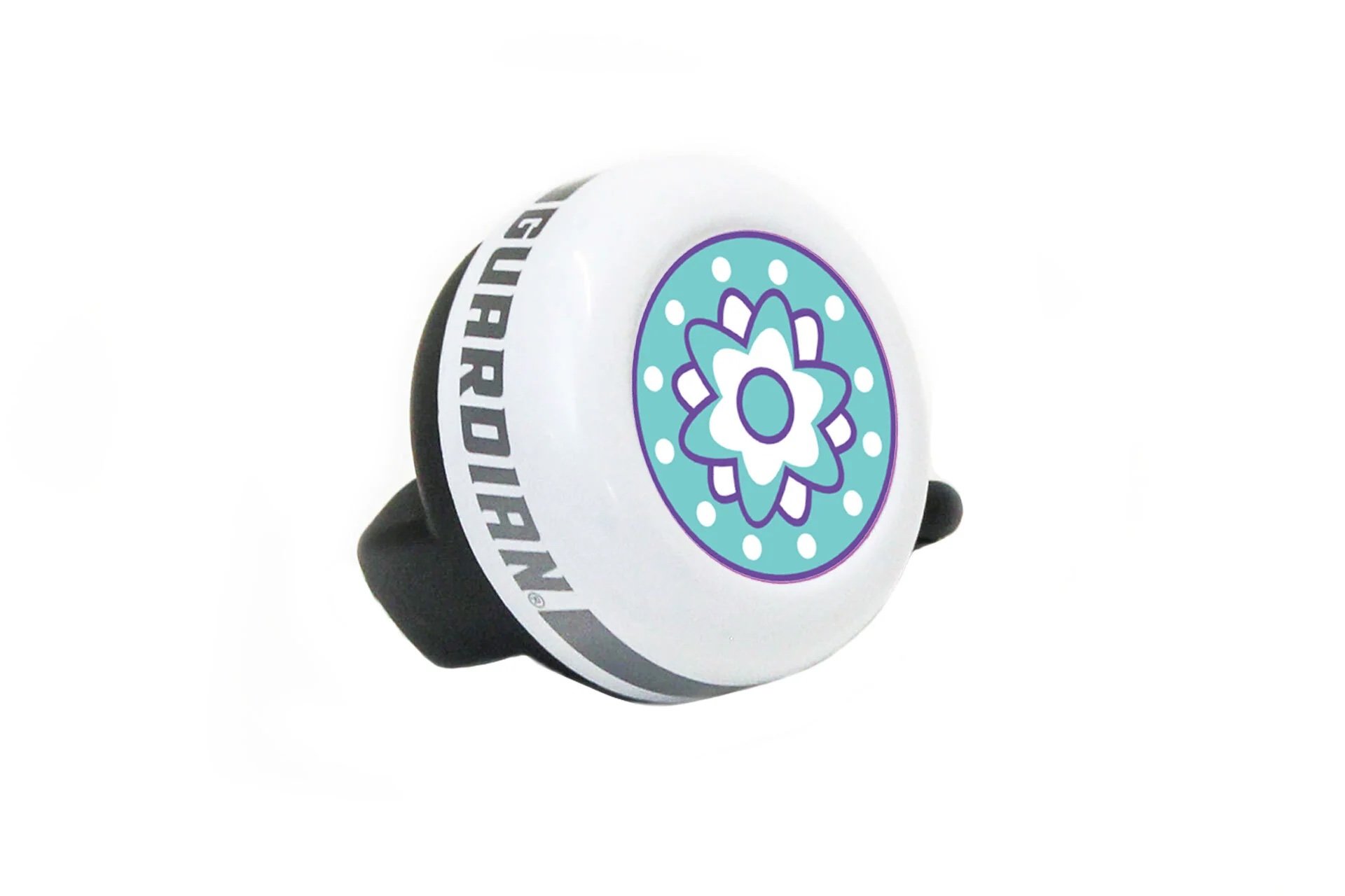
Delight Factor: Designed branded sticker sheet as a “surprise & delight” in-box element.

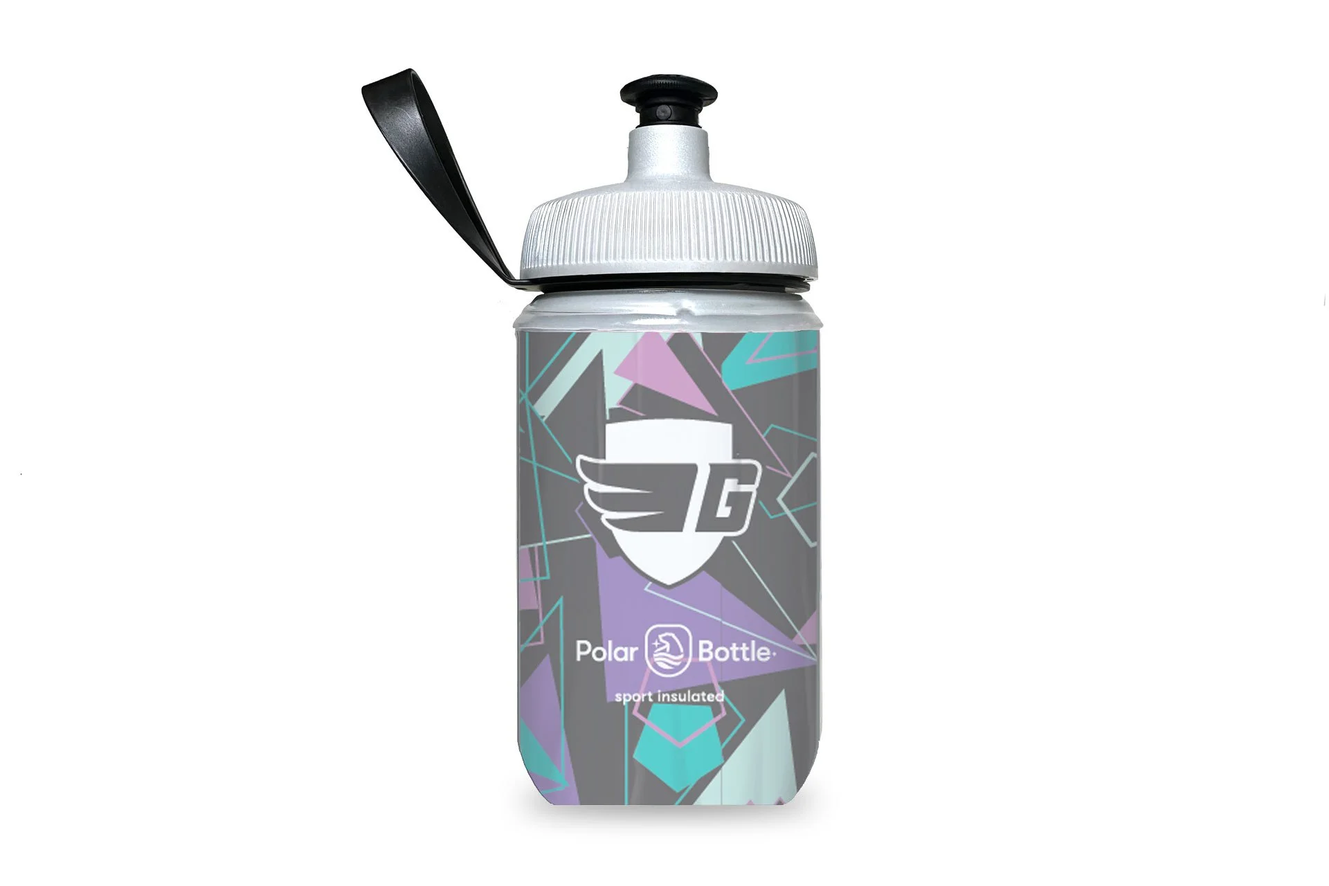
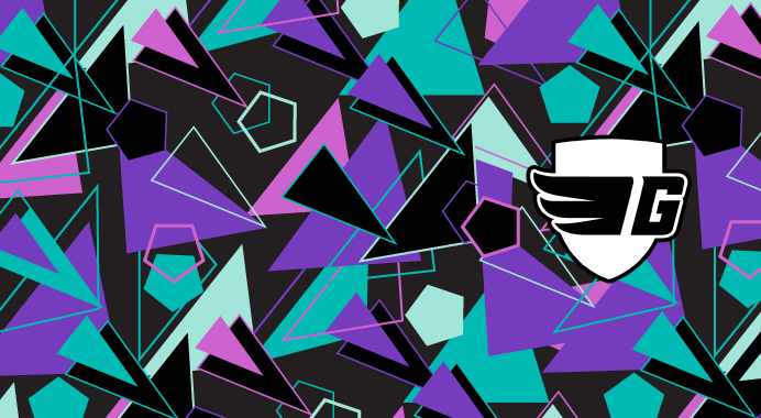
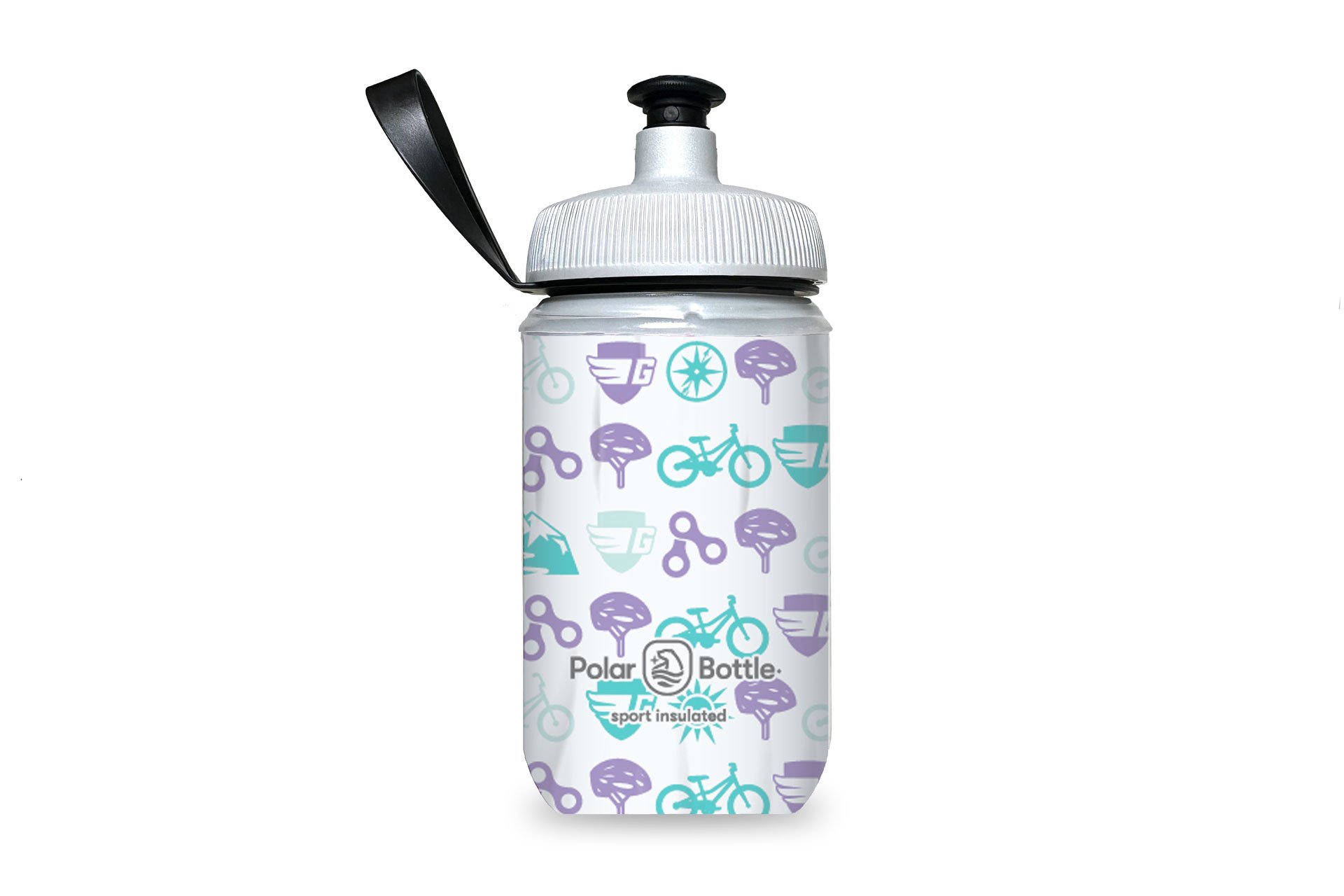
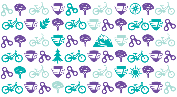
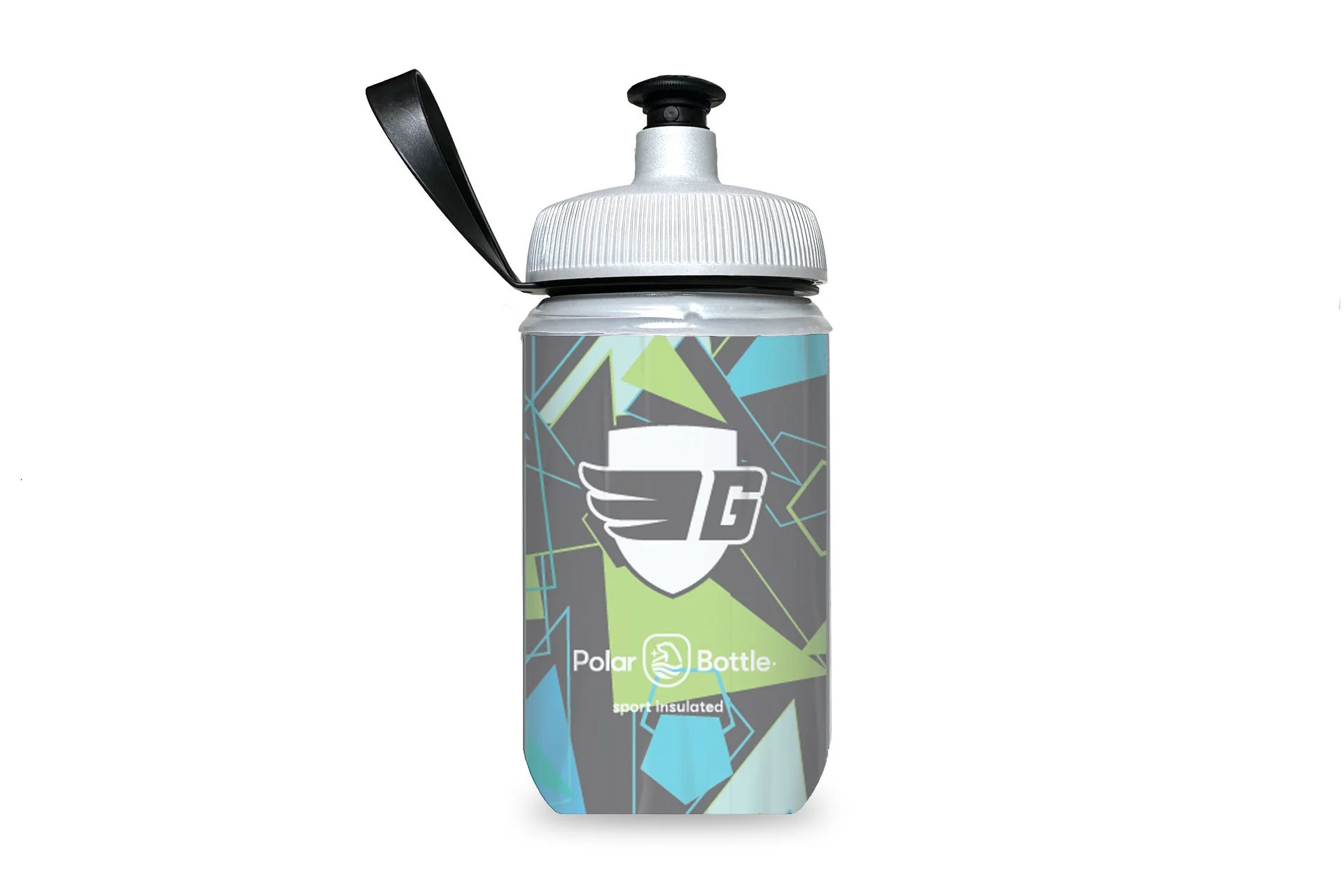
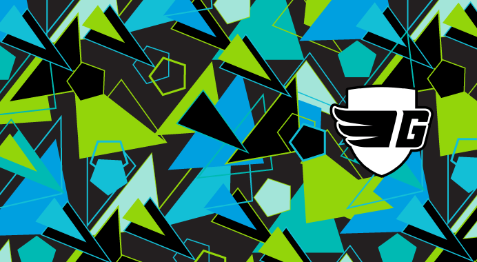
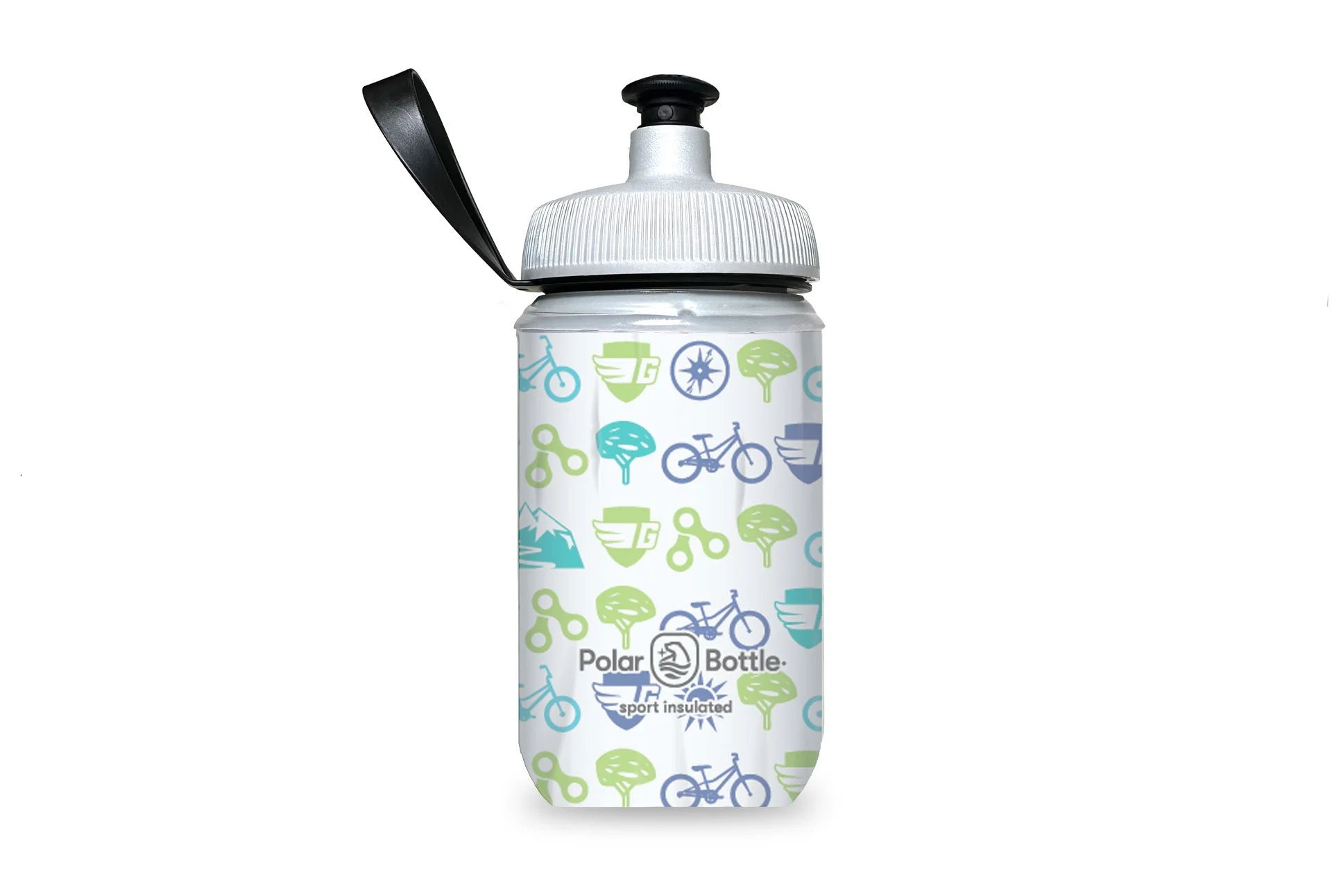
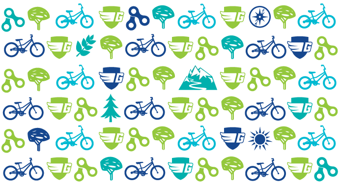
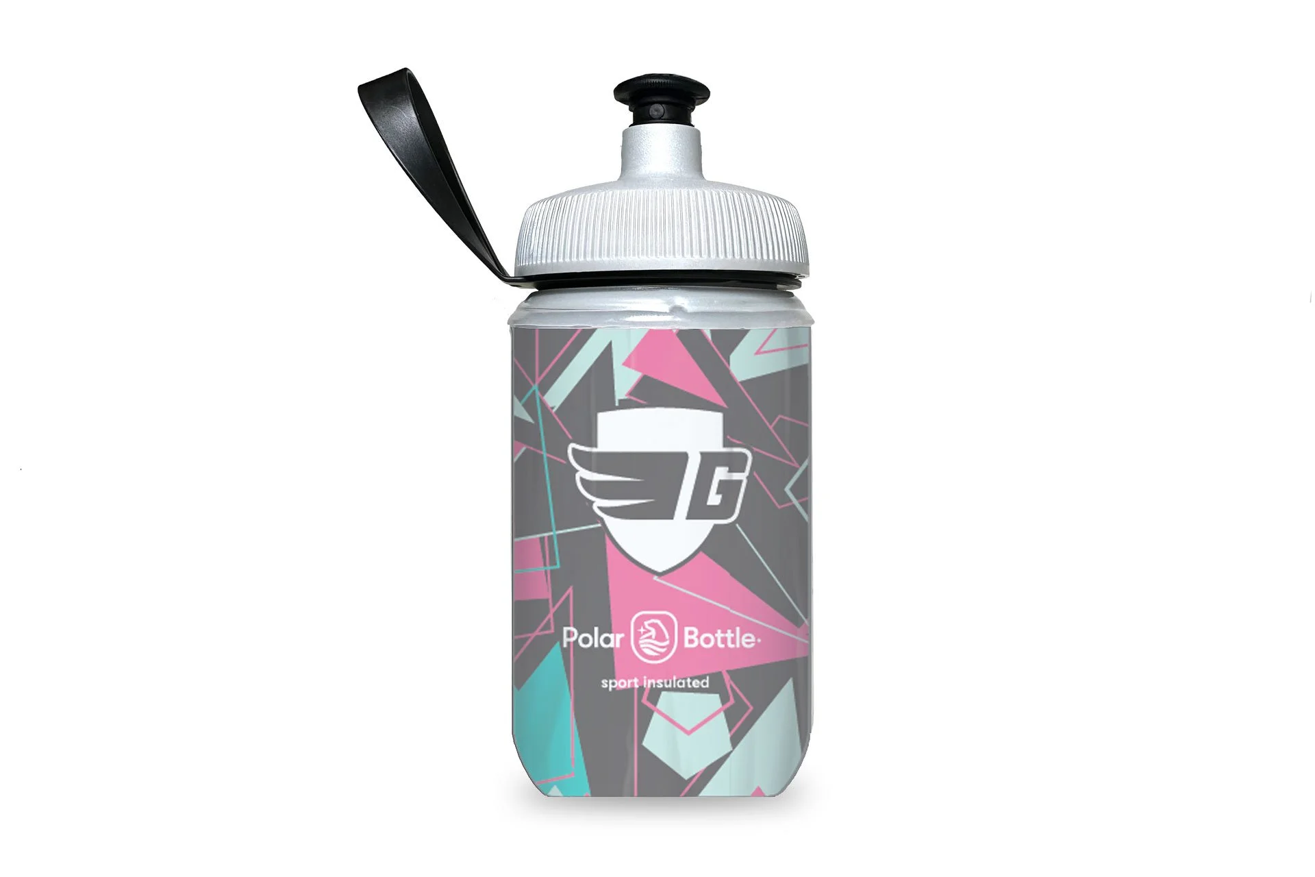
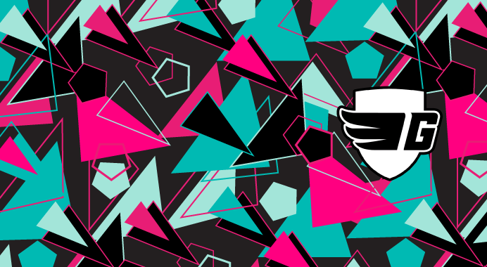
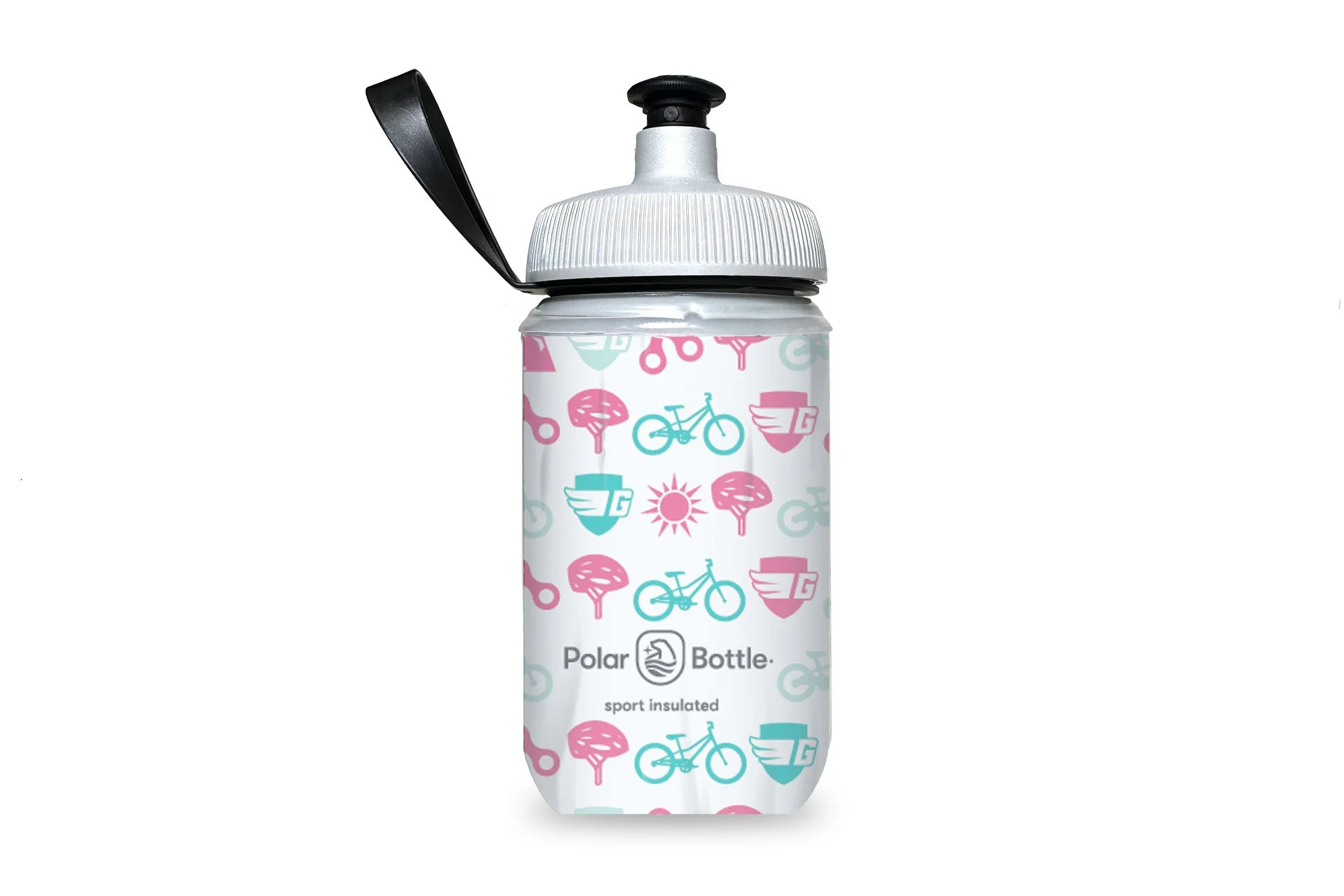
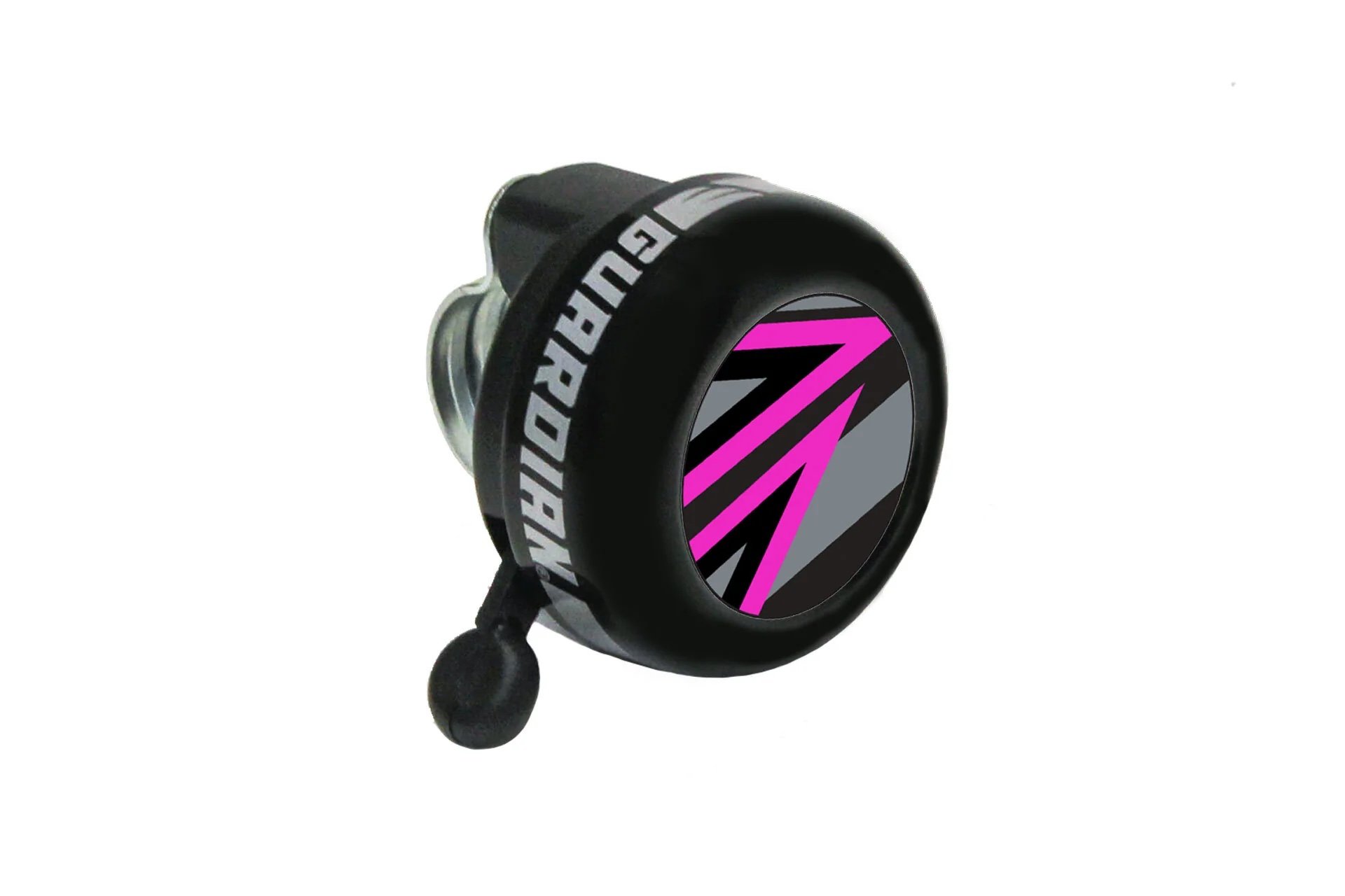
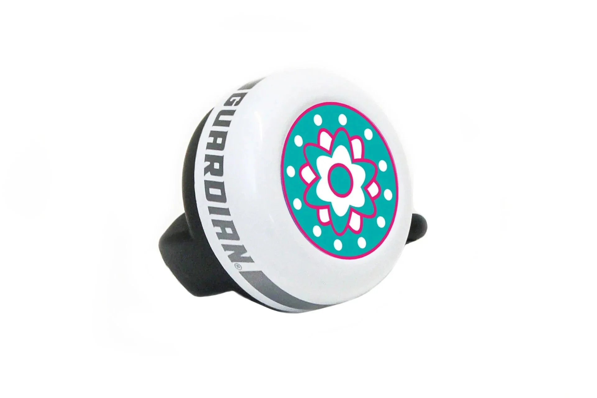
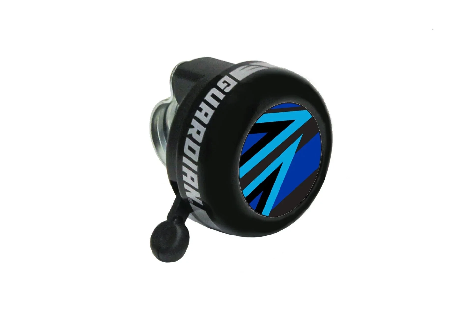
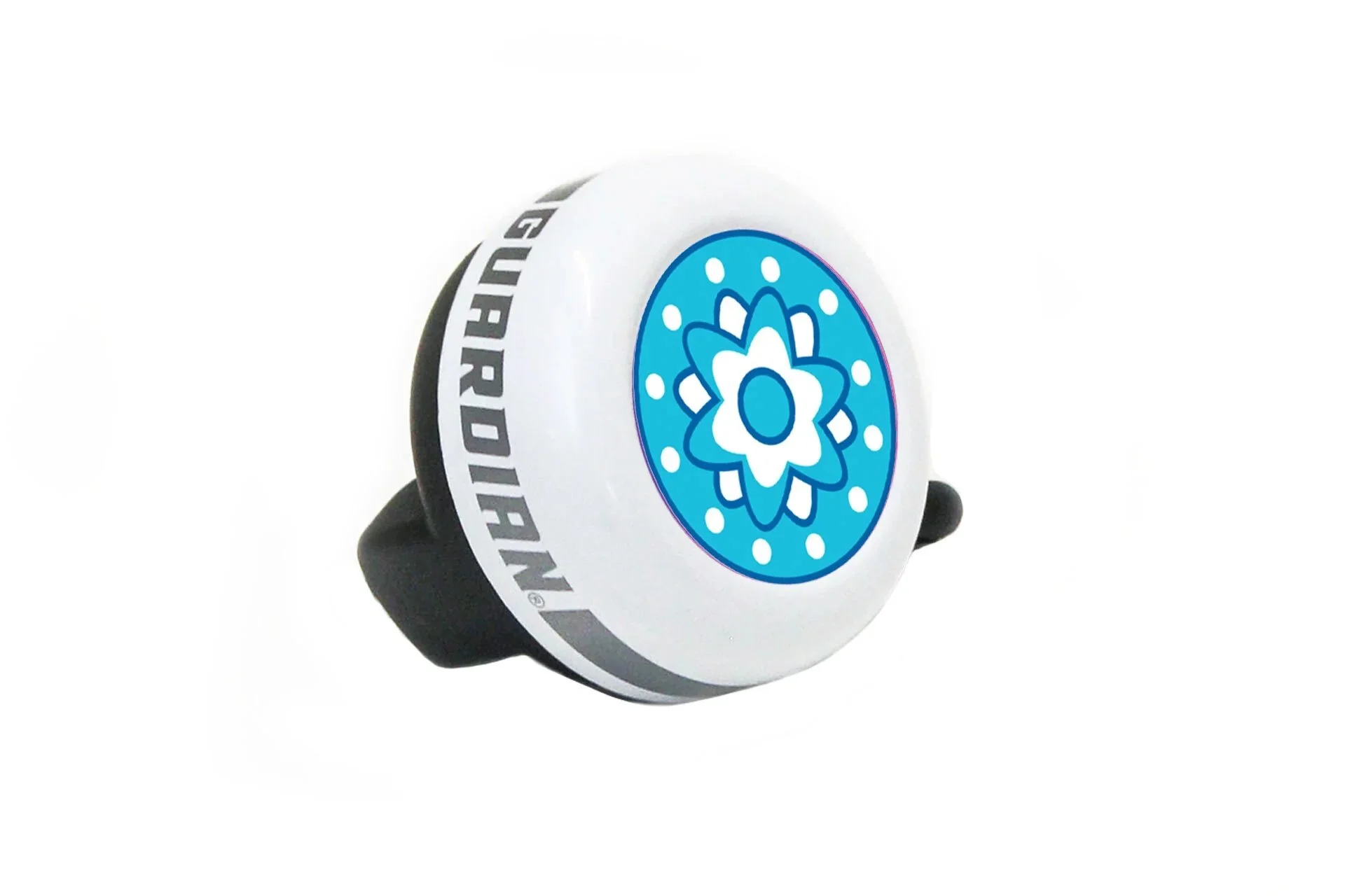
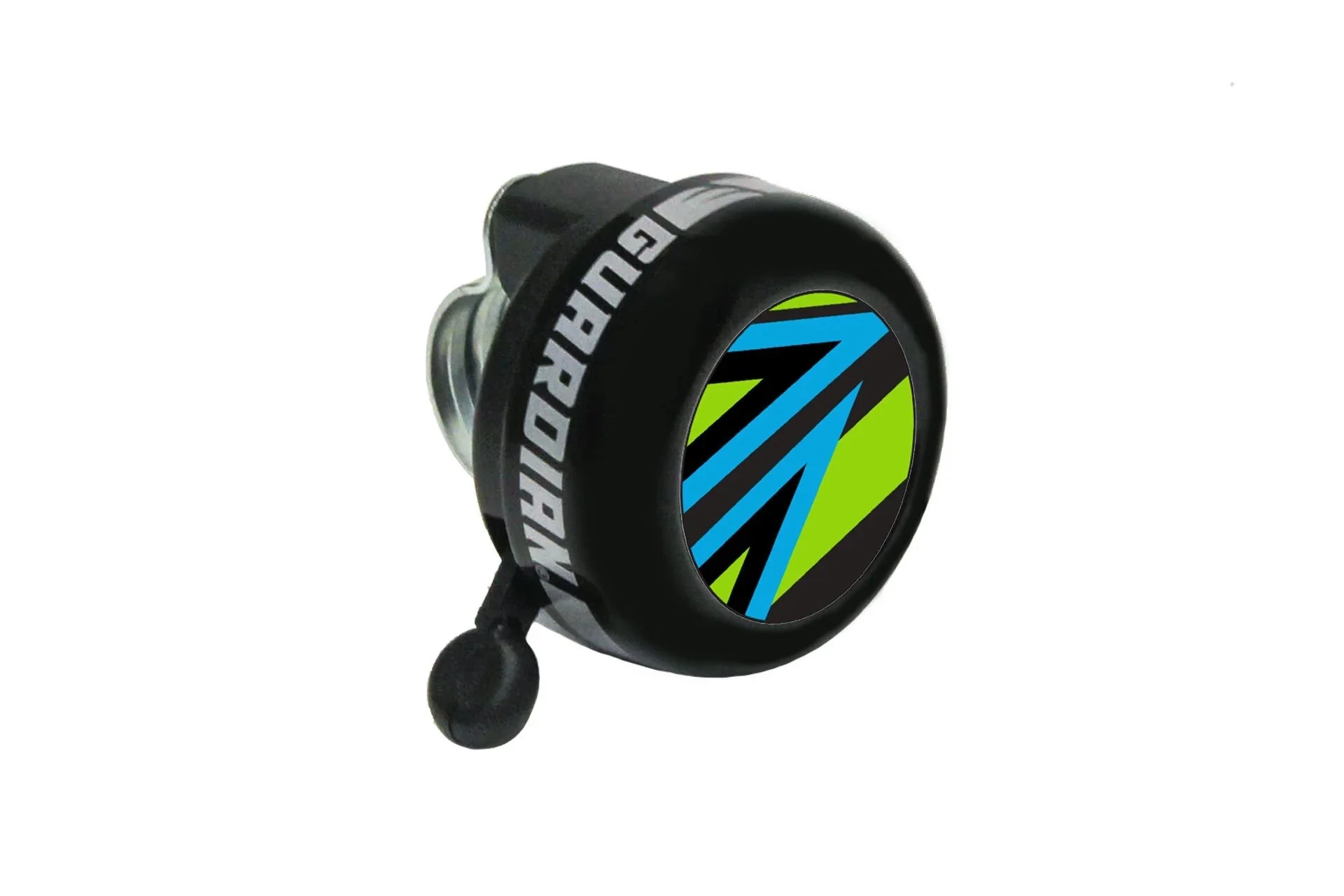
Matching Accessories Design
I led illustration and visual design for complementary products—water bottles, bells, branded apparel—with two aims: maintain Guardian’s visual identity and ease user shopping decisions.
Result: Increased accessory attachments by 33%,